Table of Contents
This user guide explains how to use the GUI Builder module of imperix Cockpit to interact with imperix power converter controllers, namely the B-Box 4, B-Box RCP, B-Board PRO, the B-Box Micro, and the Programmable Inverter. This page describes in detail how to use this module.
For new users, it is recommended to read the following articles beforehand to get started with the imperix software development kit (SDK) and imperix Cockpit monitoring software:
What is the GUI Builder module
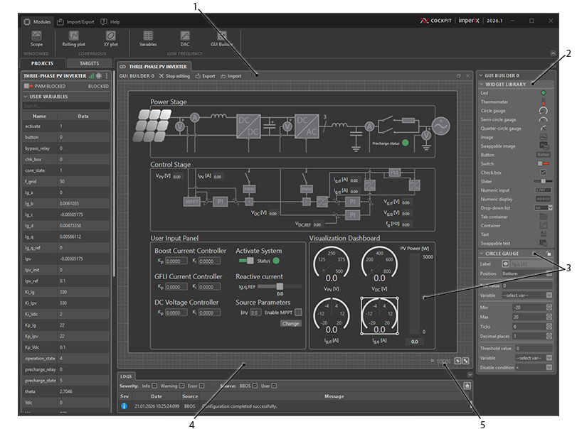
The GUI Builder module enables users to create custom dashboards for interacting with their user code running on an imperix controller.
Users can place a variety of widgets on a dedicated canvas to design tailored dashboards. These widgets are linked to user variables, allowing for real-time monitoring and modification of variables without requiring a rebuild of the control code.
This module can be integrated into a project view of Cockpit monitoring software alongside other modules, such as the Scope module and the Rolling Plot module, as detailed in the Cockpit – User guide.
On prior versions, deleting or changing part of the design will be permanent.
Editing/Operating Modes
The GUI Builder module has two distinct modes: Editing Mode and Operating Mode. The user can switch between these modes by clicking the Edit/Stop Editing button in the top bar of the GUI Builder module.
Editing Mode
In Editing Mode, users can design and configure the GUI. The following operations are available:
- Add, remove, and configure widgets.
- Link user variables to widgets.
- Apply test values to widgets.
- Import or export a GUI Builder file.
Operating Mode
In Operating Mode, the GUI Builder module is linked to the target. Changes made within the GUI Builder module directly affect the user code running on the target.
In this mode:
- The GUI cannot be modified or configured.
- Users can only interact with the widgets themselves (e.g., adjust the values of command widgets).
When switching from Editing Mode to Operating Mode, the GUI Builder module widgets synchronize with their corresponding user variables. The values from the target are applied to the GUI Builder module, not the other way around.
Widgets
The GUI Builder module offers three types of widgets for tuning and visualizing user variables: Command widgets, Display widgets, and Graphic widgets. These widgets can be added to the GUI Builder module by dragging and dropping them from the widget library onto the GUI Builder’s canvas.
Commands
Command widgets can be connected to user variables linked to Tunable parameter blocks
| Name | Icon | Description |
|---|---|---|
| Button |  | The Button widget sets the value of a variable based on a predefined set of two values. The value assigned to the user variable is the “Pressed” value when the button is pressed, or the “Idle” value when the button is not pressed. |
| Switch |  | The Switch widget sets the value of a variable based on a predefined set of two values. The value assigned to the user variable is either the “Value off” or the “Value on”. Additionally, the switch’s color can be configured for both states. |
| Checkbox |  | The Checkbox widget sets the value of a variable based on a predefined set of two values: “Checked” or “Unchecked.” |
| Slider |  | The Slider widget allows setting the value of a variable within a specified range, defined by a minimum and maximum value. The step size for adjusting the value is also configurable. |
| Numeric input |  | The Numeric Input widget allows the user to enter numeric values. The number of decimal places can be configured to control the precision of the input. |
| Drop-down list |  | The Drop-down List widget allows the user to select a value from a list of options. Each option can be configured with a display label and an associated value that is applied to the user variable. Additional label-value pairs can be added or removed as needed. |
Displays
Display widgets can be connected to user variables linked to Probe blocks or Tunable parameter blocks.
| Name | Icon | Description |
|---|---|---|
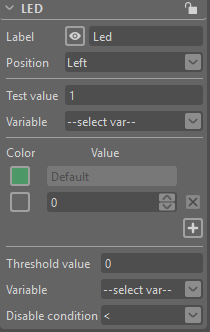
| Led |  | The LED displays a chosen color when the variable’s value matches a defined value exactly. Multiple values and colors can be configured for a given LED. If the variable’s value does not match any of the configured values, the LED displays the default color. |
| Thermometer |  | The thermometer displays the value of a variable within a specified range. |
| Gauge |  | The gauge displays the value of a variable within a specified range. The gauge is available in three different appearances circle, semi-circle, and quarter-circle gauge. |
| Swappable image |  | The Swappable Image widget displays an image based on the value of a user variable. Images can be uploaded and assigned specific values. If the variable’s value matches a configured value exactly, the corresponding image is displayed. If no match is found, the default image is displayed. Additional image-value pairs can be added or removed. The widget’s height and width can be defined while preserving the aspect ratio of the original images. |
| Numeric display |  | The Numeric Display widget shows the value of a user variable in numeric format. The number of decimal places can be configured to control the level of precision displayed. |
Graphics
Graphic widgets are visual tools to add to the GUI, they cannot be linked to any user variable.
| Name | Icon | Description |
|---|---|---|
| Image |  | The Image widget displays a static image. An image can be uploaded to the widget, and the height and width of the widget can be defined. The original image’s aspect ratio is preserved. |
| Tab container |  | The Tab Container widget organizes widgets into separate tabs. Tabs can be added, removed, or renamed as needed. Warning: Removing a tab will permanently delete all widgets contained within it. |
| Container |  | The Container widget is used to group and organize widgets. The background color can be customized. |
| Text |  | The Text widget displays editable text. The text can be modified by double-clicking on the widget. Configuration options are accessible from the mini-toolbar in the top-left corner of the GUI Builder module. Note: Once rich text formatting is applied to the widget, editing the text from the configuration pane is no longer possible. To edit the text, double-click on the widget to enter text editing mode. |
| Swappable text |  | The Swappable text widget displays text based on the value of a user variable. Specific texts can be assigned to corresponding values. If the variable’s value matches a configured value exactly, the associated text is shown. If no match is found, the default text is displayed. Additional text-value pairs can be added or removed. |
Actions
How to configure a widget
To configure a widget, select it by either clicking on the desired widget or drawing a selection rectangle around it. When a single widget is selected, a configuration pane will appear on the right bar of Cockpit.
Note that the configuration pane will not appear if multiple widgets are selected.
From this pane, it is possible to:
- Lock/unlock the widget.
- Configure the widget’s label.
- Apply test data.
- Link the widget to a user variable.
- Set specific configurations for each widget type.
- Set a threshold and the condition at which the widget will be disabled
Alternatively, widgets can be configured using the context menu. The context menu can be accessed by right-clicking on a widget. It provides additional configuration options, such as aligning widgets or sending a widget to the back/front.
How to configure the label of a widget
Double-clicking a widget’s label enters label editing mode. While in this mode, a mini-toolbar appears in the top-left corner of the GUI Builder module, offering rich text formatting options.
How to select, move and place widgets
Widgets can be selected by left-clicking on them. To select multiple widgets, hold down the Ctrl key while clicking. Alternatively, widgets can be selected using a selection rectangle.
Once selected, widgets can be freely moved on the canvas or dragged into or out of container widgets.
To align widgets, right-click on one of the selected widgets and use the alignment options from the context menu.
How to link a variable to a widget
Before linking a variable, ensure a target is connected, that a user code is running, and that the GUI Builder module is in edit mode.
To link a variable to a widget, drag and drop a variable from the User Variables pane, located on the left side of Cockpit, onto the widget. Alternatively, click on the widget to link. Then, from the widget’s configuration pane, under the section “Variable”, choose the desired variable from the drop-down list.
How to undo/redo actions
Most of the actions in GUI Builder can be undone / redone.
To undo, simply press Ctrl + Z. To redo, press Ctrl + Y.
How to pan and zoom/unzoom
To pan, hold down the Ctrl key and press the left mouse button to pan in any direction. It’s also possible to pan by clicking and holding the mouse wheel.
To zoom in and out, hold down the Ctrl key and scroll the mouse wheel up to zoom in or down to zoom out.
The current zoom level is displayed in the bottom-right corner of the GUI Builder module.
When widgets no longer fit completely on the screen, scroll bars will appear. Scrolling the mouse wheel up and down moves the vertical scroll bar. Holding down the Shift key while scrolling the mouse wheel moves the horizontal scroll bar left and right.
Also, at the bottom-right corner of the GUI Builder module, you will find two buttons, ‘Enable Auto Fit To Screen‘ and ‘Fit to Screen‘.
Autosave and Import/export
The GUI Builder module automatically and periodically saves its current state. This ensures that if Cockpit is closed and reopened, the current dashboard is saved and restored. However, if the GUI Builder module itself is closed or the project containing it is deleted, any unsaved work will be lost. To avoid this, the import/export feature can be used to save and reload dashboards created with the GUI Builder module.
The Export feature allows the user to save a dashboard, including any images added to image widgets or swappable image widgets. The Import feature enables the user to load previously exported dashboards into the GUI Builder module.
GUI Builder Examples
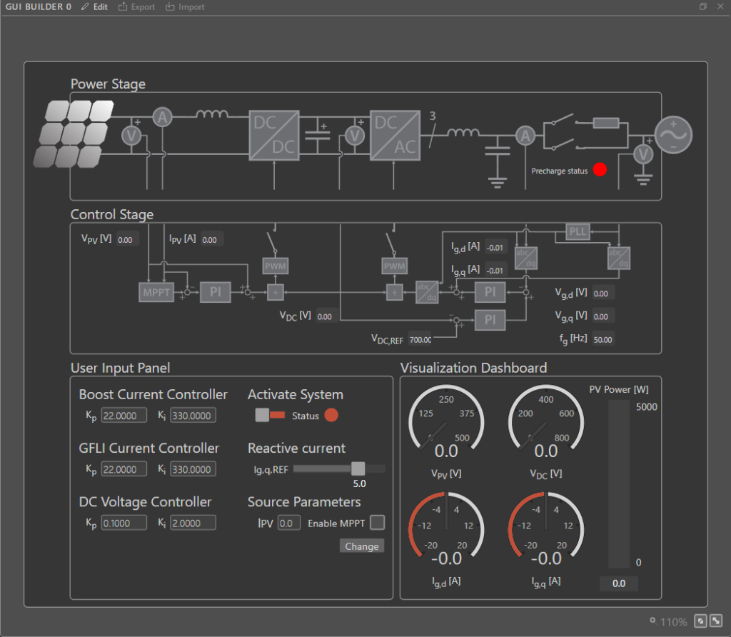
- This example implements the control for a three-phase PV inverter. Such a system can be typically found in small industrial photovoltaic facilities, which are directly connected to the low voltage power grid. Further details are provided in Three-phase PV inverter for grid-tied applications
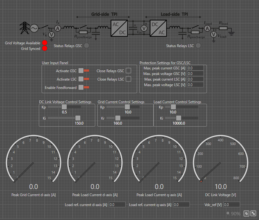
- This example implements a back-to-back three-phase converter developed using imperix’s rapid control prototyping solutions. The system features two TPI8032 (TPI) converters managed by a single centralized controller in a master/slave configuration. Further details are provided in Back-to-back converter with grid-tied LCL filter
 By Julien Orsinger • March 29, 2021 • PN152
 By Stéphane Lovejoy • April 12, 2022 • PN300
 By Benoît Steinmann • March 30, 2021 • AN006